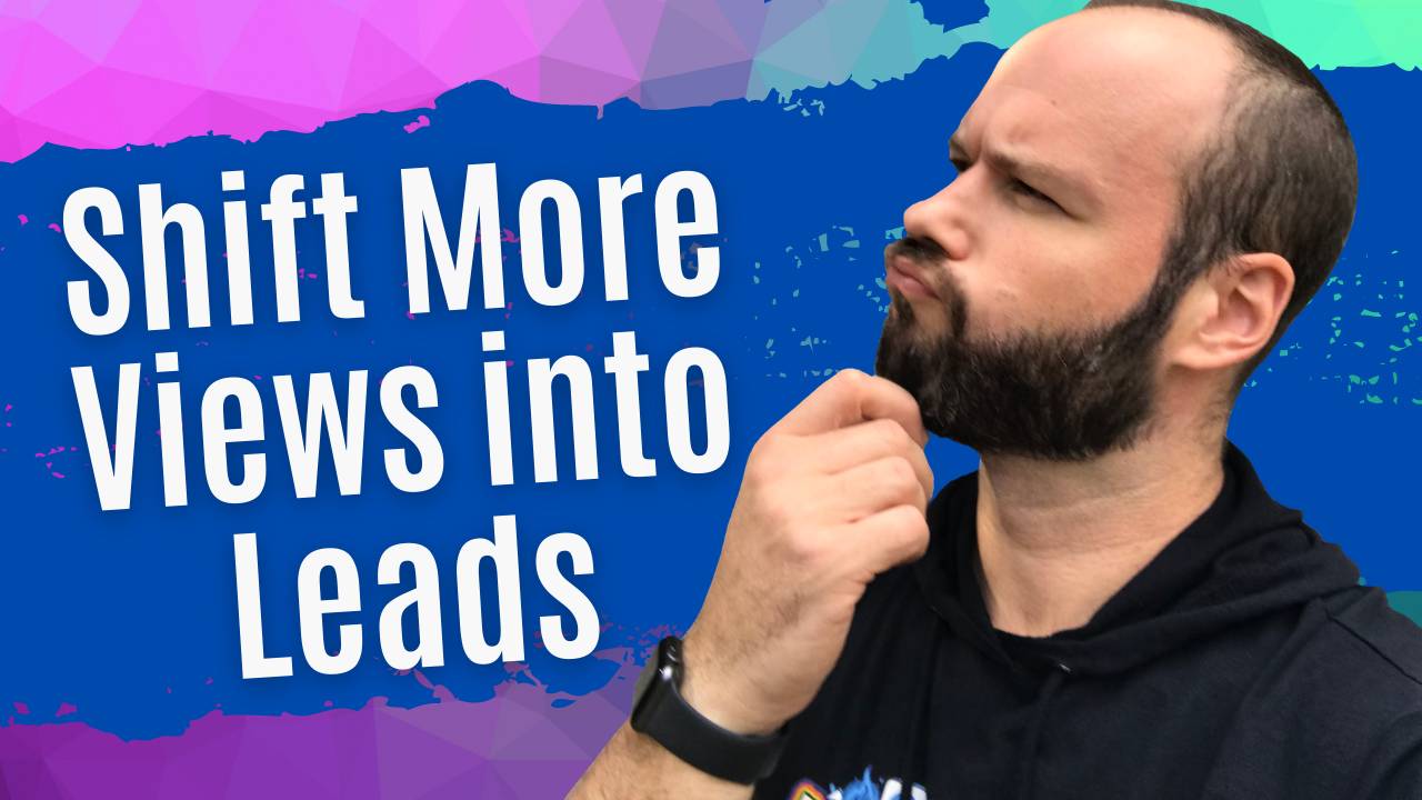
Hey, everybody. Andy Stickel here. In this video, I’m going to show you four elements that will make your Facebook ads way better. Now, I talk to lawyers all the time and they say, “I tried Facebook advertising but it just didn’t work for me. I ran ads and I paid money for them, all that stuff but it didn’t work.” Typically, when I look at their ads, they’re missing these four important elements. And I’m going to show what these elements are right now. In fact, this is actually a slide from a presentation I did for the Personal Injury Lawyers Marketing Association just yesterday, actually. Then I was thinking, “You know, this is something that a lot of people really need to know.” (Switching over to my screen here.) This is an ad that I’ve run before that has worked really, really well for me. And there are four elements in this ad. And I want to go over what each of these elements is.
There are four elements. And these are also in order of importance.
- The first element is the pattern interrupt.
- The second is the first line of the copy.
- The third element is the image or the video that you use.
- The fourth is the headline.
The First Element
I’m going to cover each one of these. The first thing that is really the most important part of any ad that you have on Facebook is the pattern interrupt. The reason why is because, you have to picture, if you think about your potential client on Facebook or on Instagram, here’s what they’re doing. They are sitting here with their phone and they’re scrolling and they’re scrolling and they’re scrolling and they’re scrolling. You literally need to interrupt them. That’s why it’s called a pattern interrupt. There’s a pattern that’s happening on Facebook or Instagram. And what you have to do is you actually have to grab them by the shoulders and say, “Hey, this is for you. This is interesting. Pay attention.” People are attracted to shiny objects. That’s why I use a lot of the things in my ads that I use as a pattern interrupt.
Let’s look at this ad. (Showing visual example) `What is the pattern interrupts here? Well, the pattern interrupts are everything that is circled in blue. The first and most important pattern interrupt in my ads is the very big red bar at the top with the text “Hey Lawyers!” Now, obviously, I’m targeting lawyers. That’s why I have a big pattern interrupt that says, “Hey Lawyers!” Now, there’s a couple of things here. First of all, it is a very big red box, which is going to get your attention because it’s red. It’s contrasting the colors that are typically found on Facebook. Facebook has blue and white. If I were to run this ad on YouTube, it probably wouldn’t work as well unless I did something that was contrasting the red because red is a YouTube color. I’d probably do something with blue or green or something like that, which really stands out from the YouTube colors. And then, also, it says, “Hey Lawyers!” so I’m basically calling out the actual demographic of the types of people that I want to watch this video.
In this section, the second most important part of this image. The image is made with maximum contrast for effect. Basically, what I do, I have my editor or when I edit videos myself, I always boost the contrast and I boost the saturation. That’s really going to make the colors pop. Now, another thing I want you to notice is, in the background, I’ve even got a light that’s actually shining on my brick wall just to make the colors pop. And I do this in almost all my videos. You can even see I’ve got the lights going right now. It’s an LED light that I just got from Amazon. You get four LED lights for $97 or something like that. You shine them on the wall. And then when we throw this into a post, it’s going to really pop, which is really cool and it gets people’s attention. The other thing is the first line of the text up top here where it says, “Hey Lawyers!” That’s really important also because that copy is actually one of the most important parts of the entire ad. And most people will read that before they will actually read the headline at the bottom of the ad. It’s really important to call out your demographic in two different places. Now, I don’t always start all my ads with “Hey Lawyers!” Sometimes, I’ll start with “Law Firm Owners” or “Lawyers Need To Know This” or something. But, usually, within the first couple of words, the first two or three words, I’m saying lawyer, law firm owner, attorney, something like that because I want people to look at that and I want them to self-identify and see, “Oh, this is talking about me.” You would do the same thing in your ads. Now, that brings us to the second most important thing, which is the first line of the copy.
The Second Element
Now, the first line of the copy is the part that’s circled in orange. And I personally consider this to be the headline of the entire ad. Now, technically, if you look at your Facebook ads, Facebook actually will consider the part that’s in green at the bottom of the headline. But this is really the headline because it’s at the top of the Facebook ad. What I always want to do in the first line of the copy is I always want to call out my demographic. Also, I also want to address a problem or introduce some sort of curiosity. With this one, it’s “Want to know how to protect your firm during these uncertain times?” Most lawyers want to know that, so this ad worked really well. But I could also do something like, “Hey, lawyers. These are the three things that will ensure that you don’t go bankrupt in the next 90 days” or “Law firms that make these three mistakes are more likely to go bankrupt”, something like that where it’s a curiosity. Listicles work really well if you can introduce a number there. That top right there, this first line is your second most important part of this entire ad.
The Third Element
Now, the third part, as I said, is the image or video. That’s also part of the pattern interrupt but, also, you want to make sure that you’ve got an image or a video that is extremely bright. Typically, I try to have a big face in it if I can. But you always want to make sure that you’ve got an obvious contrast, a very bright image that’s going to pop. Because, again, you’re trying to get people’s attention. You’re trying to break that pattern. And you’re trying to make them stop what they’re doing and pay attention to your ad. And unless you have these elements, it ain’t going to happen. Now, the final thing is the headline. And the headline is what’s at the bottom in green here.
The Fourth Element
Now, what I like to do with the headline is I try to have the headline provide some sort of benefit. “So, basically, by paying attention to this ad or if you do the call to action, if you click this button, here’s the benefit that you’re going to get.” In this ad, I did, “This strategy will help your law firm thrive during this time.” And you always want to test a lot of different variations of these out. But, usually, I want to benefit. If you’re a personal injury attorney and you’re running an ad to try to get car accident cases, you would say, “We fight to help car accident victims get paid for pain and suffering, medical bills, and lost wages.” Over the last year, I’ve spent probably $600,000 or close to it on Facebook ads and I’ve done so profitably. And this structure is a big, big part of why I’ve been able to make Facebook ads work. When I look at law firms and I see that their ads are not working, it’s usually because they’re not doing anything to actually get someone’s attention. That’s the biggest thing about this entire thing, are you’ve got to get someone’s attention. There’s an ad that I’ve run and maybe you’ve seen it where I literally had a gavel and I’m banging the gavel in front of the camera and then I say, “Hey, lawyers.” That’s a pattern interrupt. People have commented that they don’t like it but, at the end of the day, I look at the numbers and it works. That’s really all I care about. I mean, I understand you can’t please everybody and that’s what it is. But, you know what, that video works really, really well. It gets really good conversations and it’s a profitable ad because of the fact that it has that pattern interrupt. Once again, if you’re going to run a Facebook ad, you need to make sure that you have all these elements, make sure that you’ve got a pattern interrupt, make sure you’ve got a first line of copy that is really compelling.
Summary
The first line of copy, you typically want it to call out the demographic and then also provide some sort of curiosity or benefit. The image needs to pop. If it’s an image or if it’s a video, it needs to make sure that it pops. And make sure that your headline provides a value. Now, if you implement these, I promise you your Facebook ads will perform much, much better. I hope this was helpful. If you guys have any questions, let me know in the comments below. Feel free to send me a direct message or shoot me an email. I will talk to you guys soon.


