Today, I want to show you how to increase your click-through rate. If you send an email out to your mailing list, do a monthly newsletter, or if you’re thinking about starting a monthly newsletter, you want people to click on your links.
I want to show you a cool trick that will make people click on your link, go visit your website, read what you have to say, and do it much more often than they do now. This trick also works well with Facebook Ads, and it works especially well with YouTube thumbnails too.
It’s just really easy. Anyone can do it. You don’t need any type of technical ability. So with that said, I’m going to hop over to my computer and walk you through exactly what I’m talking about.
About The Email
First, I have an email for a personal injury law firm that we work with and he is targeting motorcycle accidents. He’s trying to get cases from people that have been involved in motorcycle crashes. What he does is he provides a ton of value for motorcycle riders, and he does it in the form of videos.
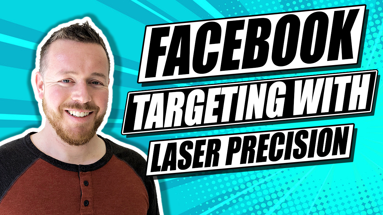
What we do is we send out emails to his email list. Specifically, every day, we send out a short email like this, and we say, watch now. We also put the video thumbnail in there, and we found that this thumbnail really increases the click-through rate.
About Thumbnails And How To Get Them
The problem was that I’m not a graphic designer. The thumbnail we use is a cool, elaborate thumbnail, and we have to pay our graphic designers every time we want to do one of them. When he does a video every single day or every other day, you can see how this can get a little expensive.
So, we came up with a new way to create our thumbnails. We’re now using Canva.com, which is a completely free website (although it does have a paid upgrade version). We’re now using their software to make our thumbnails ourselves. I think they look even better than the ones our designer used to make.
The Importance Of Thumbnails
A lot of times, people don’t use thumbnails. What they do instead is they write a really long description. In fact, they write a novel, and then they wonder why people don’t click on it. Of course, there’s nothing enticing to look at. Just in case this isn’t obvious, the entire goal of sending an email is to get people to click on the link.
We do not want them to figure out from the email what the answer is to the question that we’re asking in the subject line. For example, we may ask, is it possible to avoid laying your bike down? We’re not going to answer that in the email. This is just a teaser to get them to click on the link to the video. This builds authority and the brand.
Now, we wanted to create a thumbnail without having to pay a graphic designer. Let me show you how we’re doing this.
How We Create Our Thumbnails
First, we’re going to canva.com.
Once you’re there, you can see they have all these different custom dimensions. Pick the one that is most appropriate for your needs.
What’s cool in Canva is that they’ve got over a million images. What we could do is pull up images about motorcycles.
We’ll see all those motorcycle images here, and a lot of them are free. I’m picking out an image of a dirt bike. Let’s go with something that’s kind of colorful.
You select your image, check whether it’s free, and take it from there. Next, you’ll want to edit the image and as part of that, you’ll want to use a filter so that it’s very contrasty and sharp because it’s going to be small and when things have a strong contrast and are sharp, they just look better, are more interesting, and they’re more eye-catching.
So how do you do that? Just click “filter” and then click on “advanced options.” Now turn the brightness down a little bit and turn the contrast up, by about 30 percent. You can also turn on the blur feature to make the picture blurry.
Next, boost the saturation to really make the colors pop. Anyone who’s interested in motorcycles will notice it and is likely to click on it.
After that, we want to put a little bit of text over this image to attract people’s attention even more. You’ll want to think of a short attention-getting phrase.
Just click on the text, type it up, and drag it right over to the image. I like using a font like a block font. Select the new font and also change the color to your liking. Pick one that contrasts well with the image.
Once you have the image the way you want it, just hit download. I usually recommend that you pick the PNG version. Now you’ve got an image that you can insert into your email, and you can create a link where if they click on it, it’ll take them right to your blog post or to your video. It’s super simple. It works so well, and it will get you great click-through rates!


